Since before the COVID pandemic hit the United States, I have been curious about how to measure the impact in ways that are not subject to misinterpration.
This graph shows deaths, from all causes, broken up by state and ranked per 100,000 people (according to the 2020 census). It is interactive. Click around to drill down into the data.
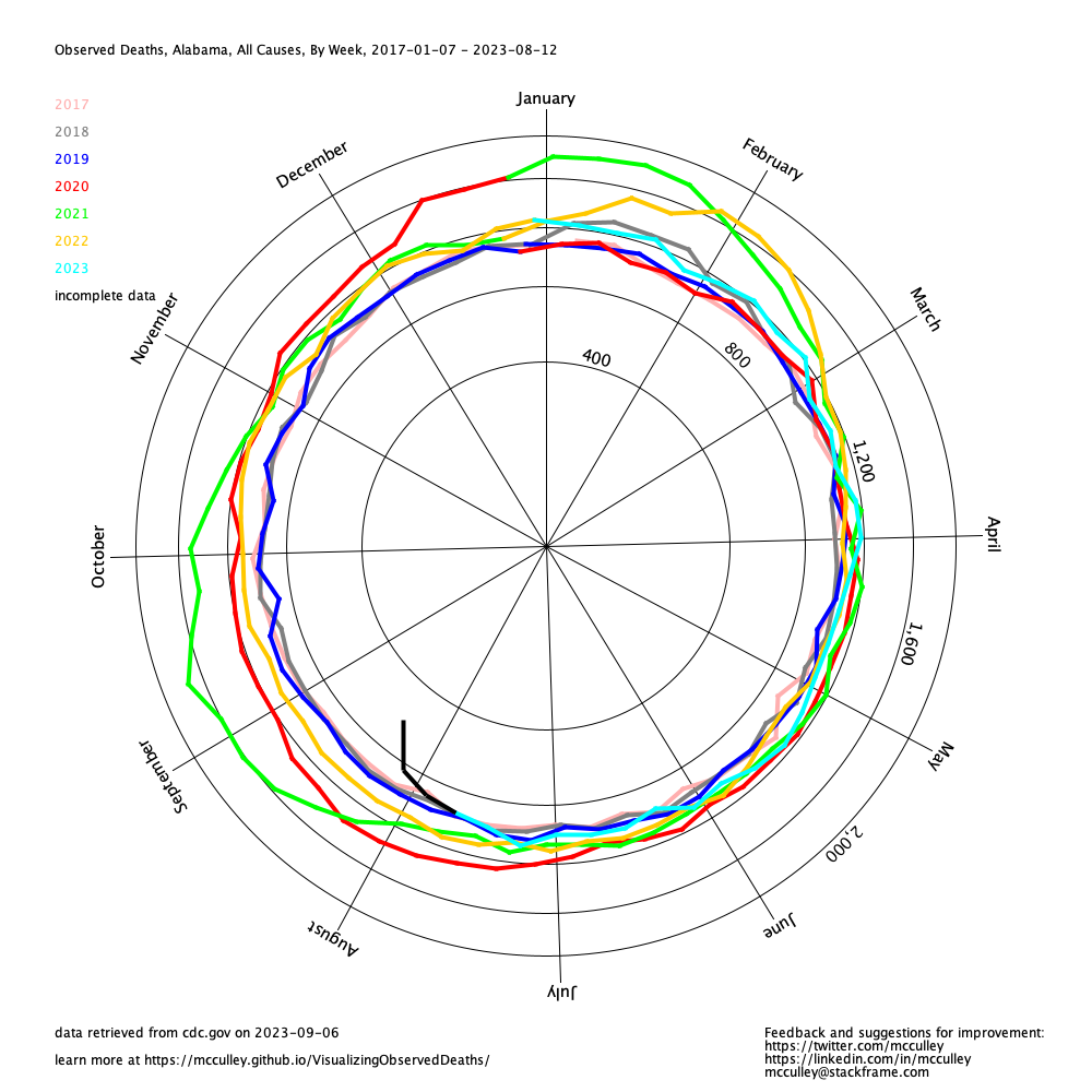
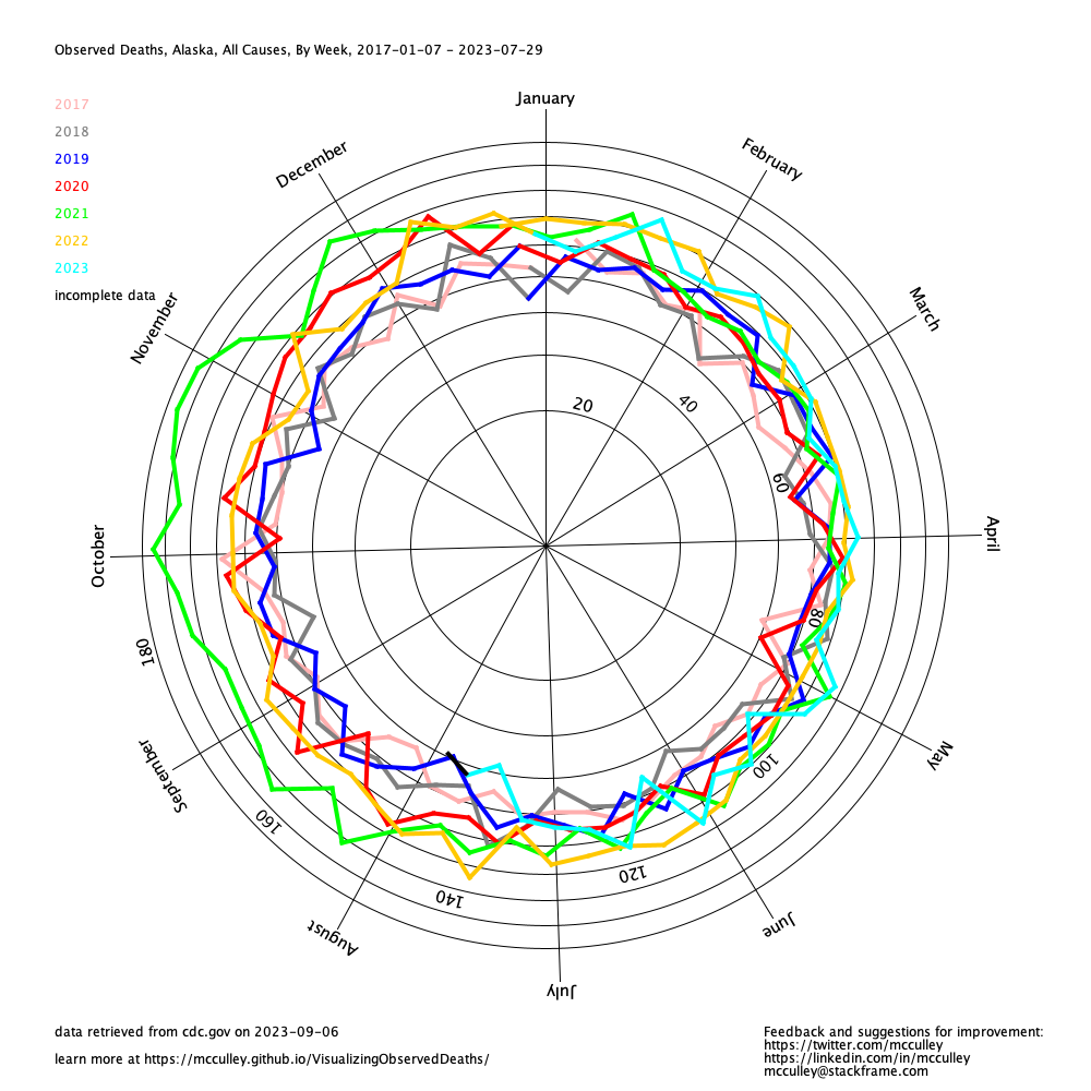
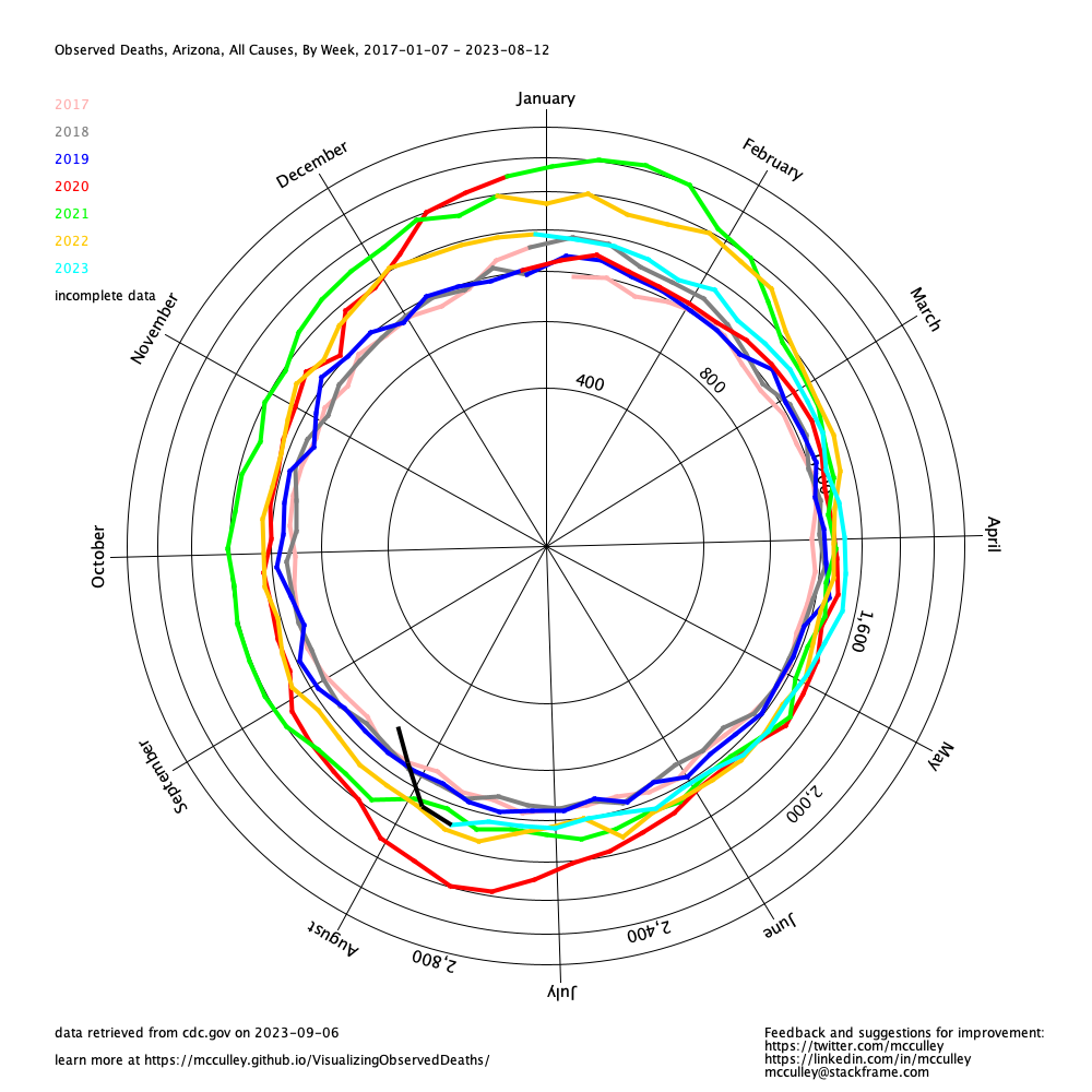
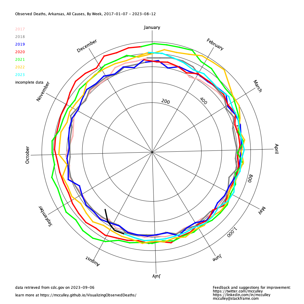
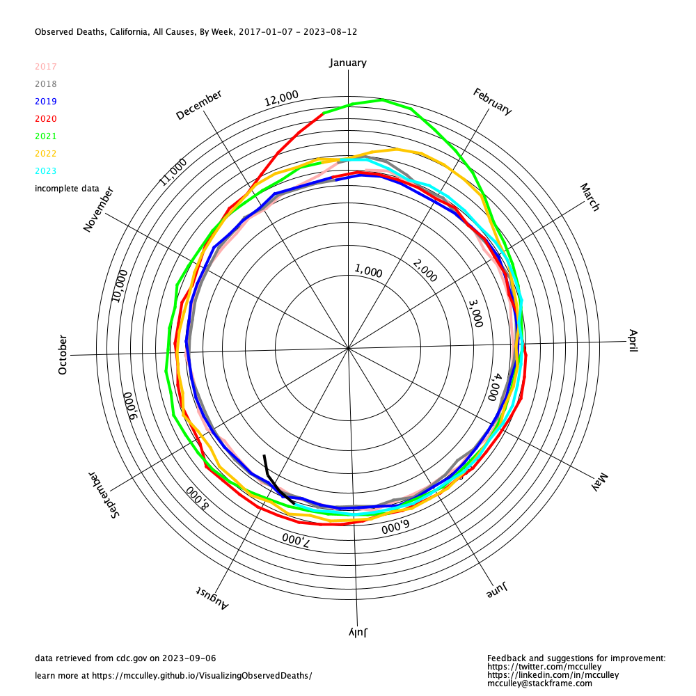
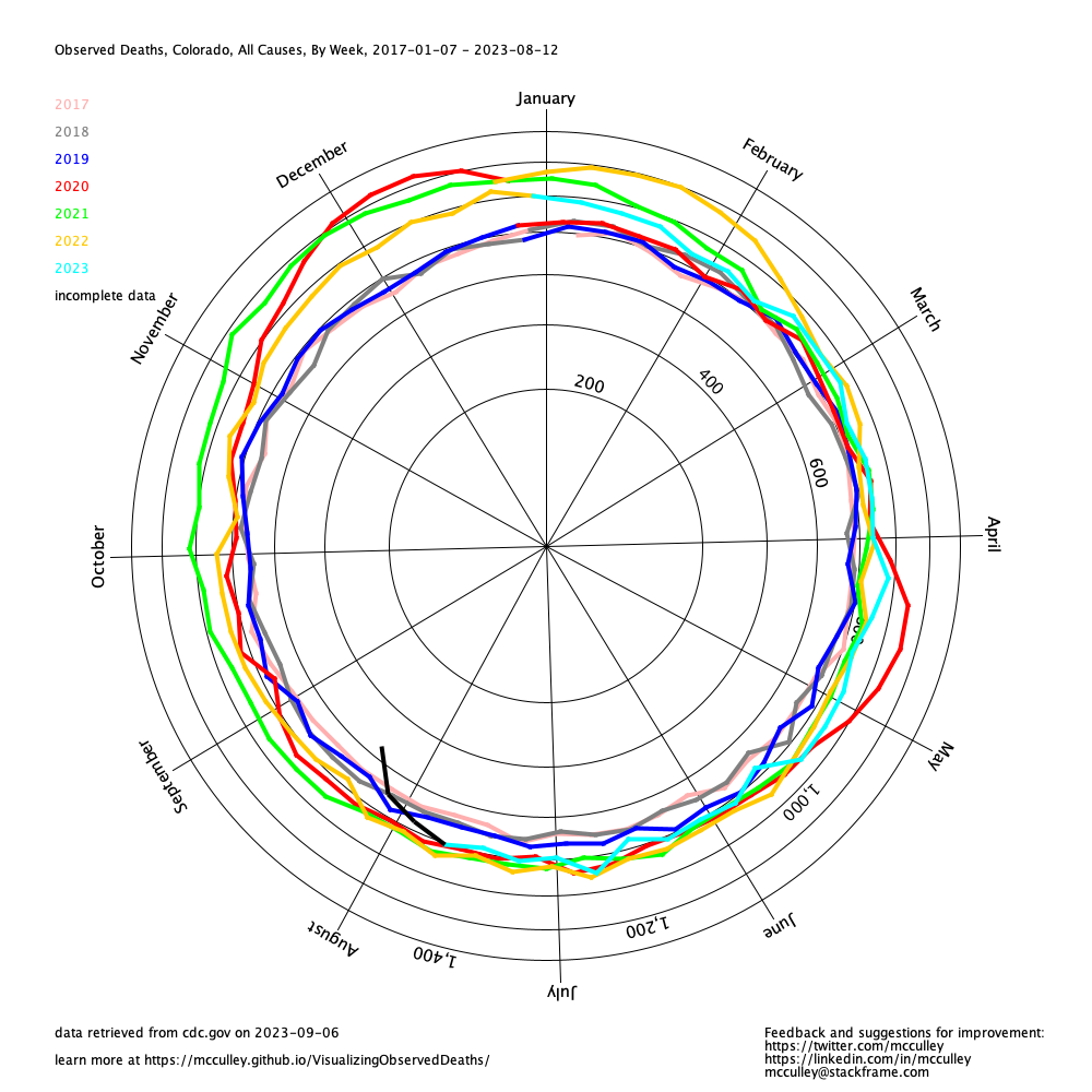
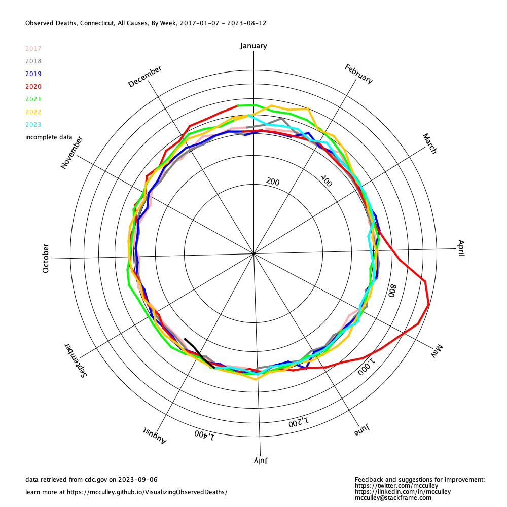
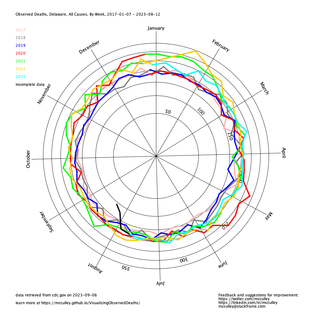
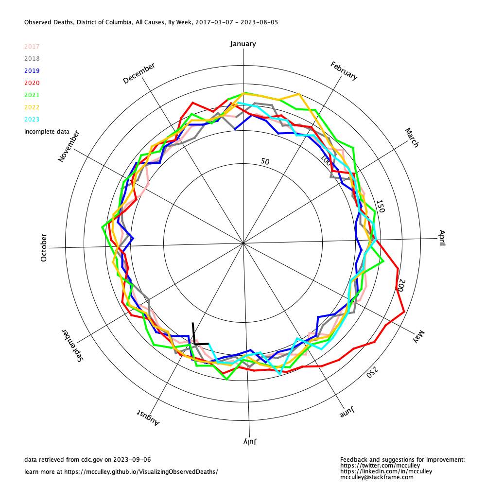
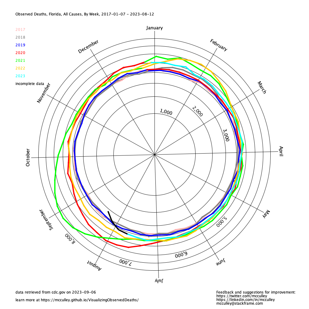
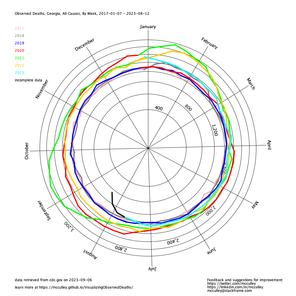
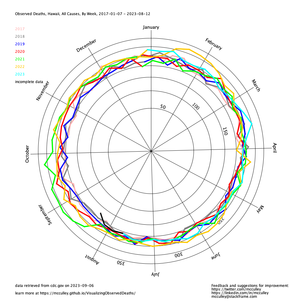
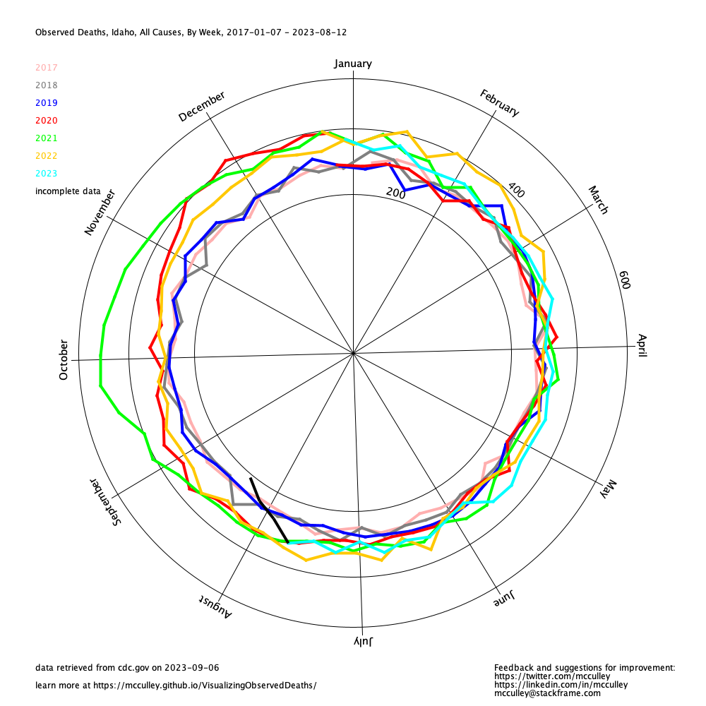
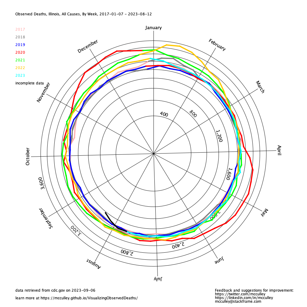
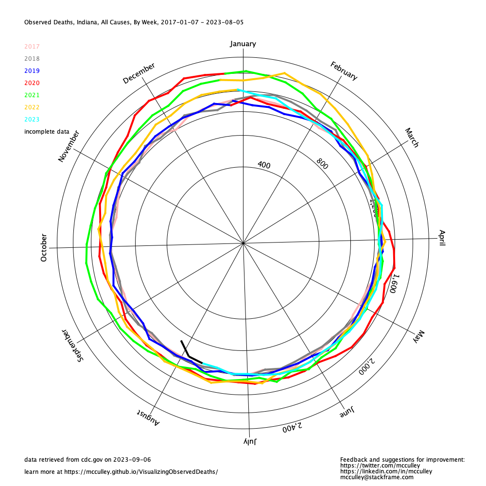
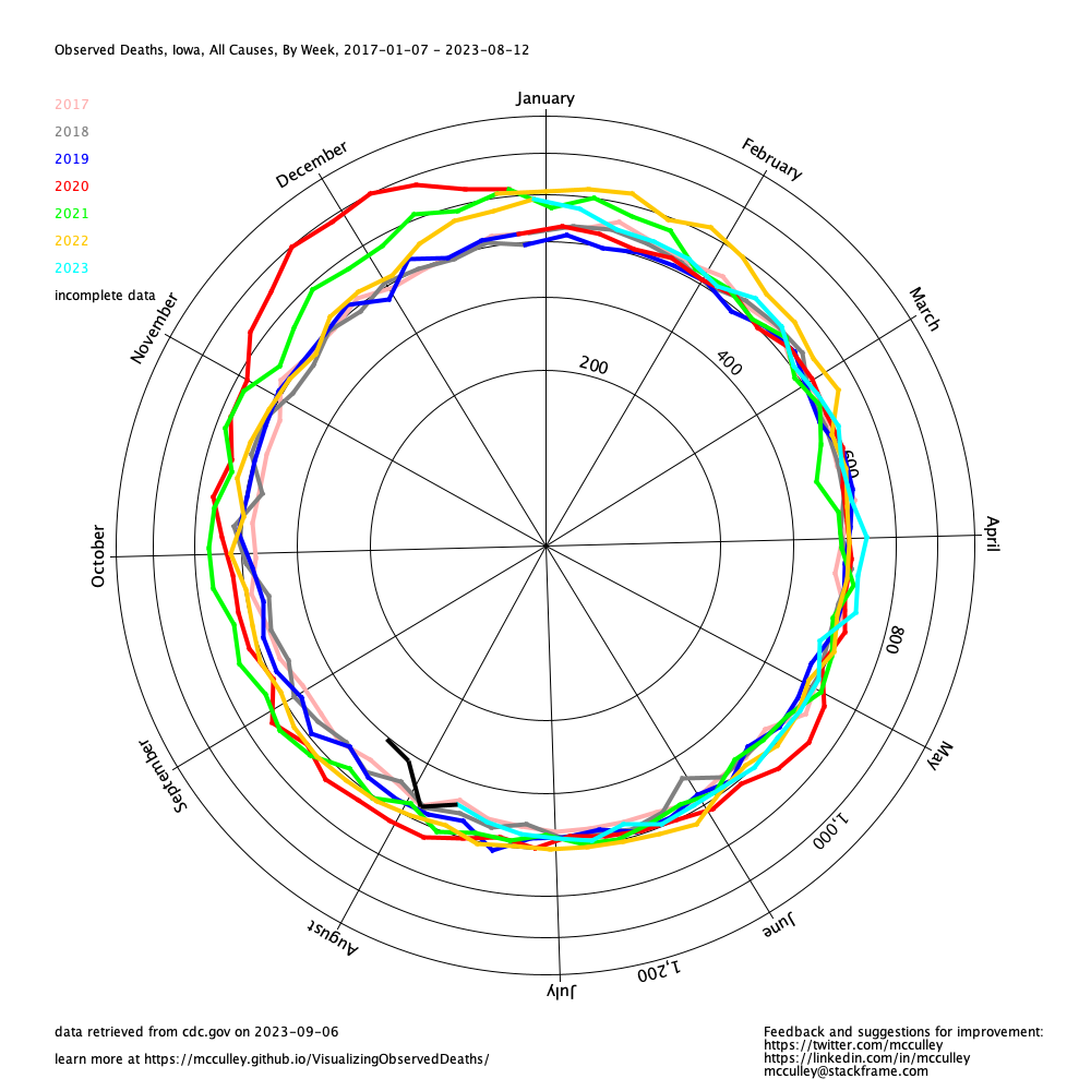
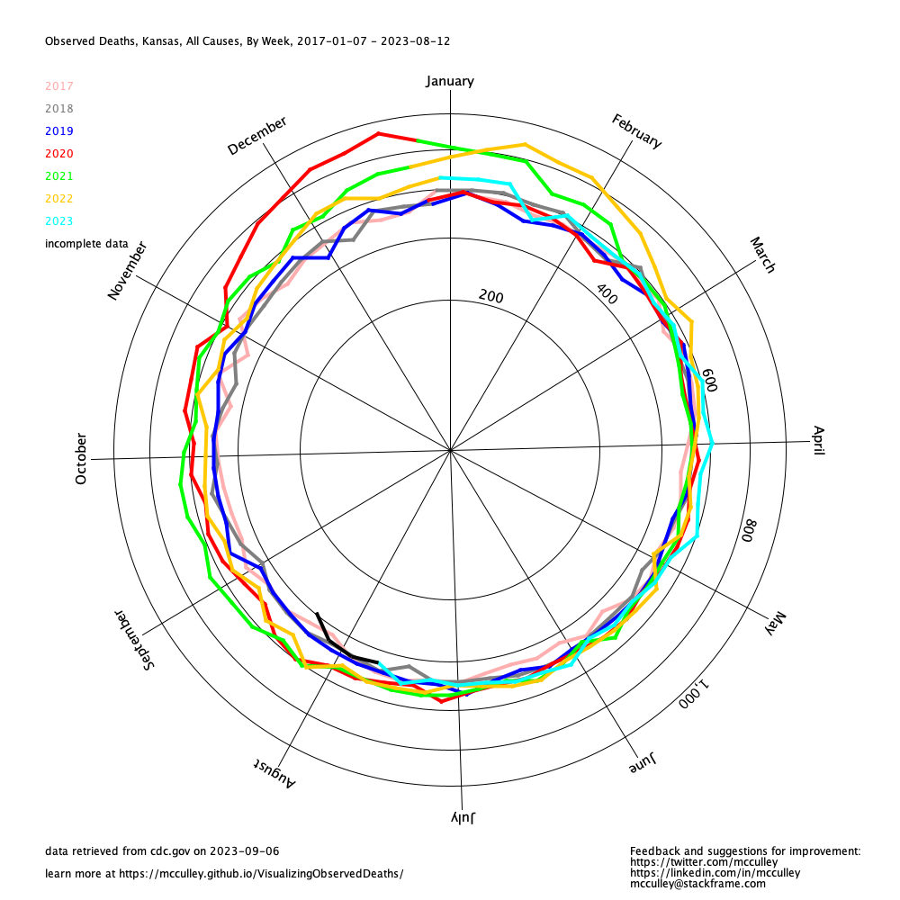
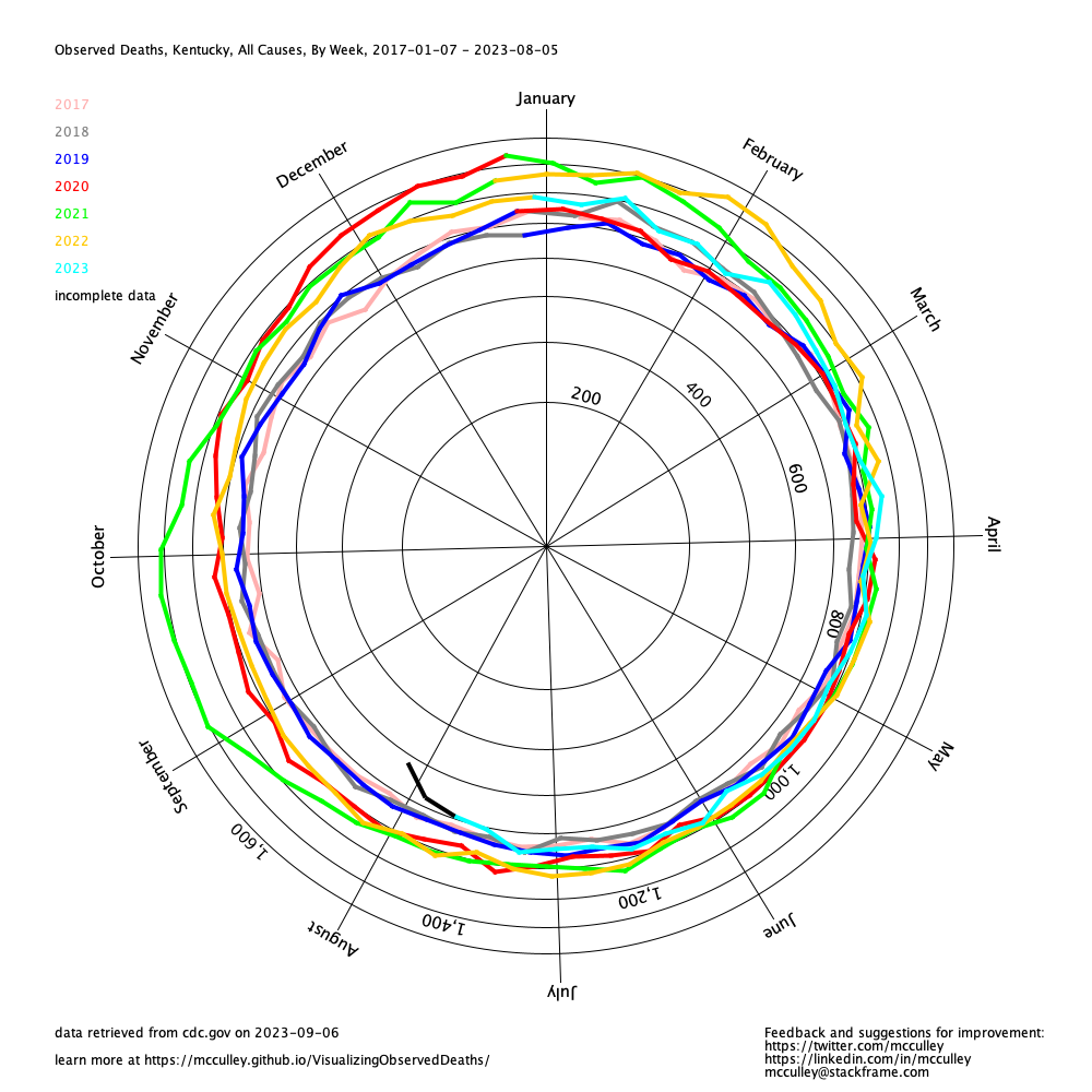
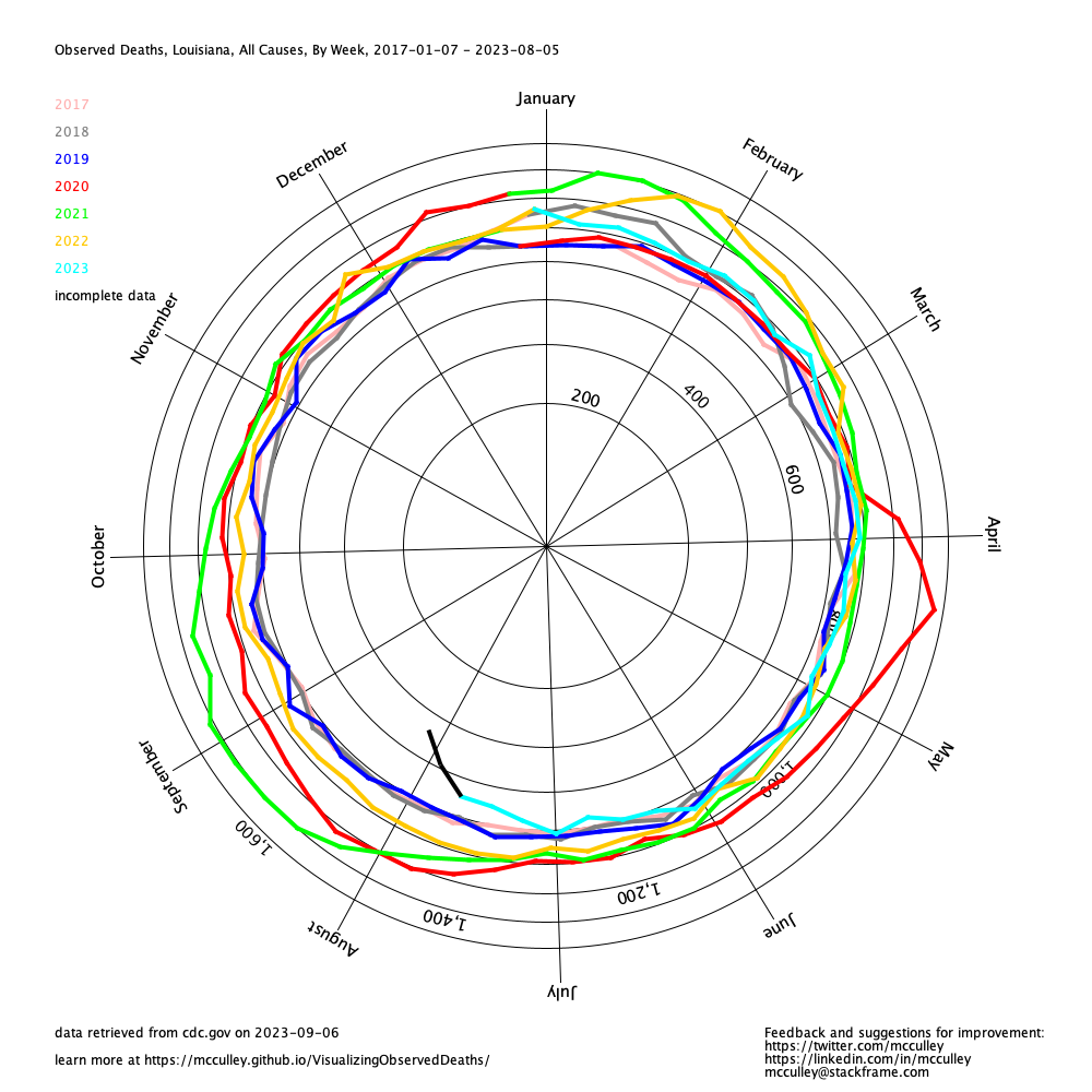
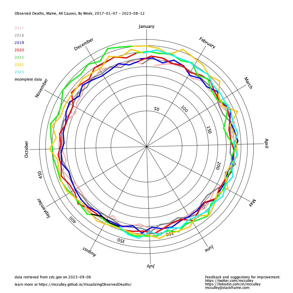
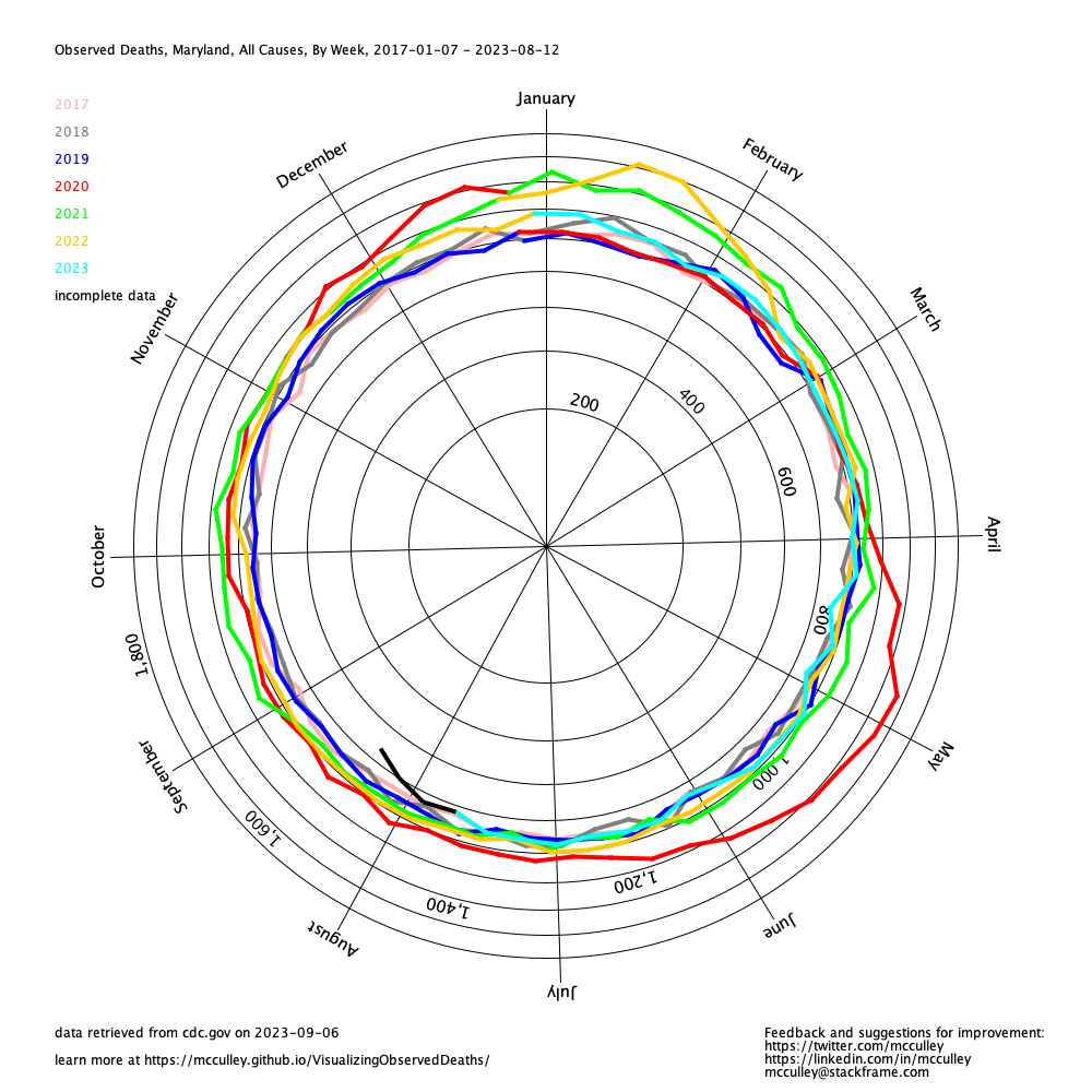
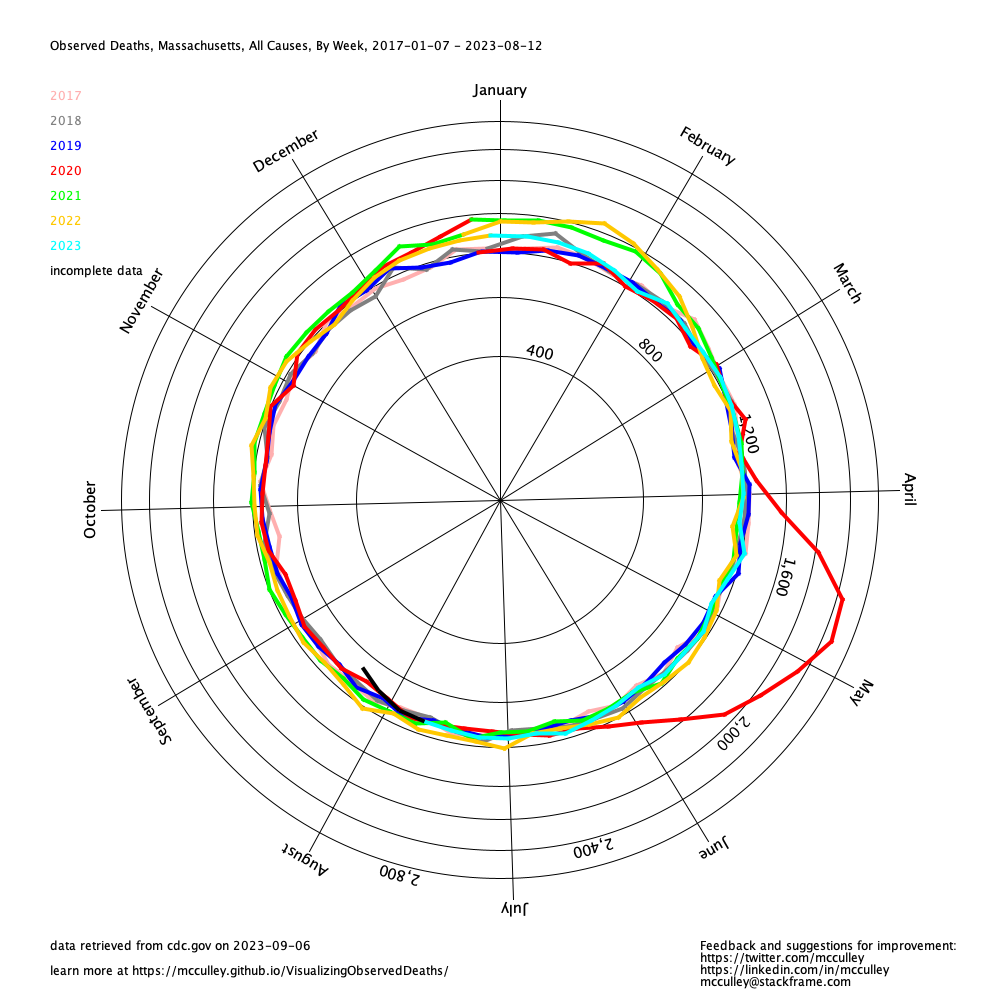
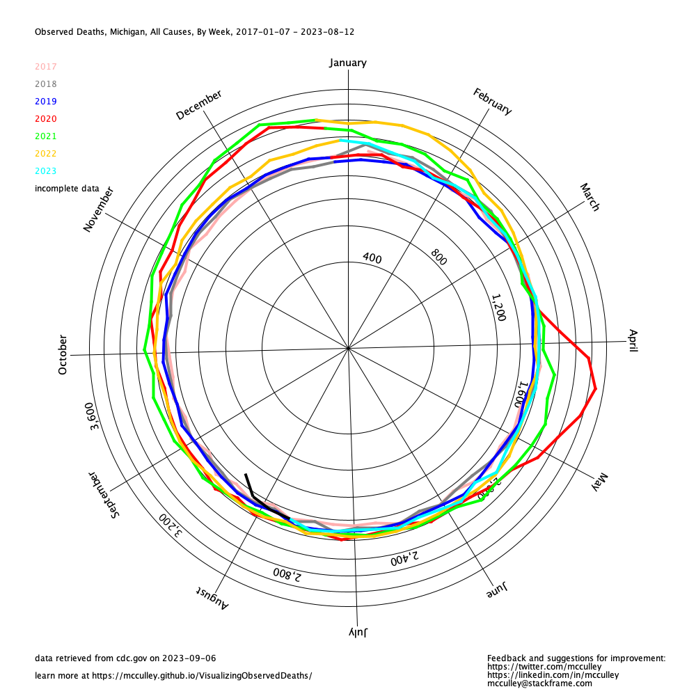
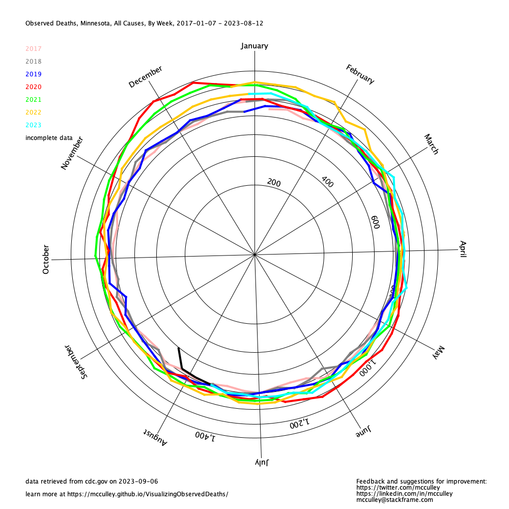
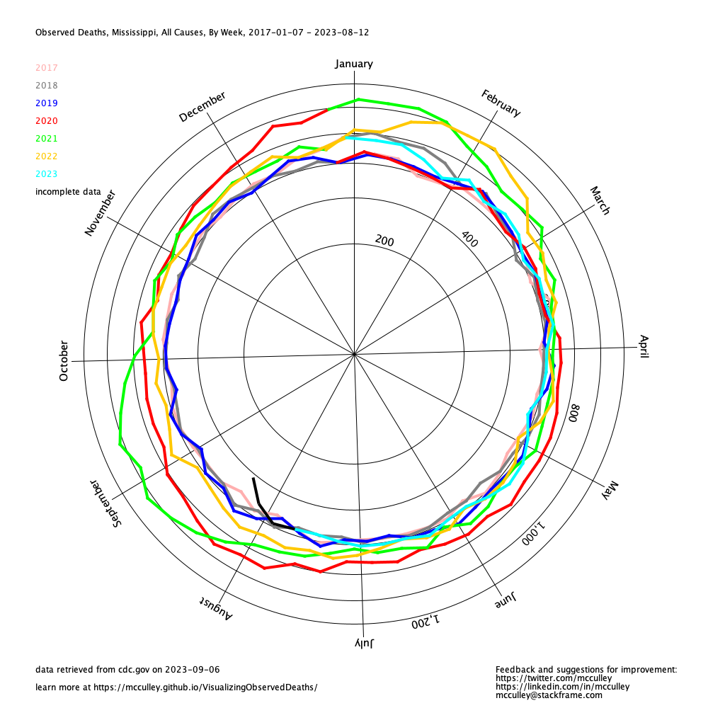
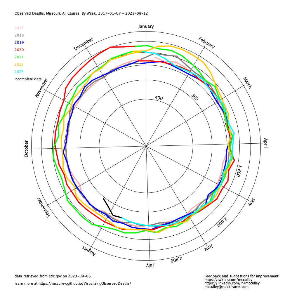
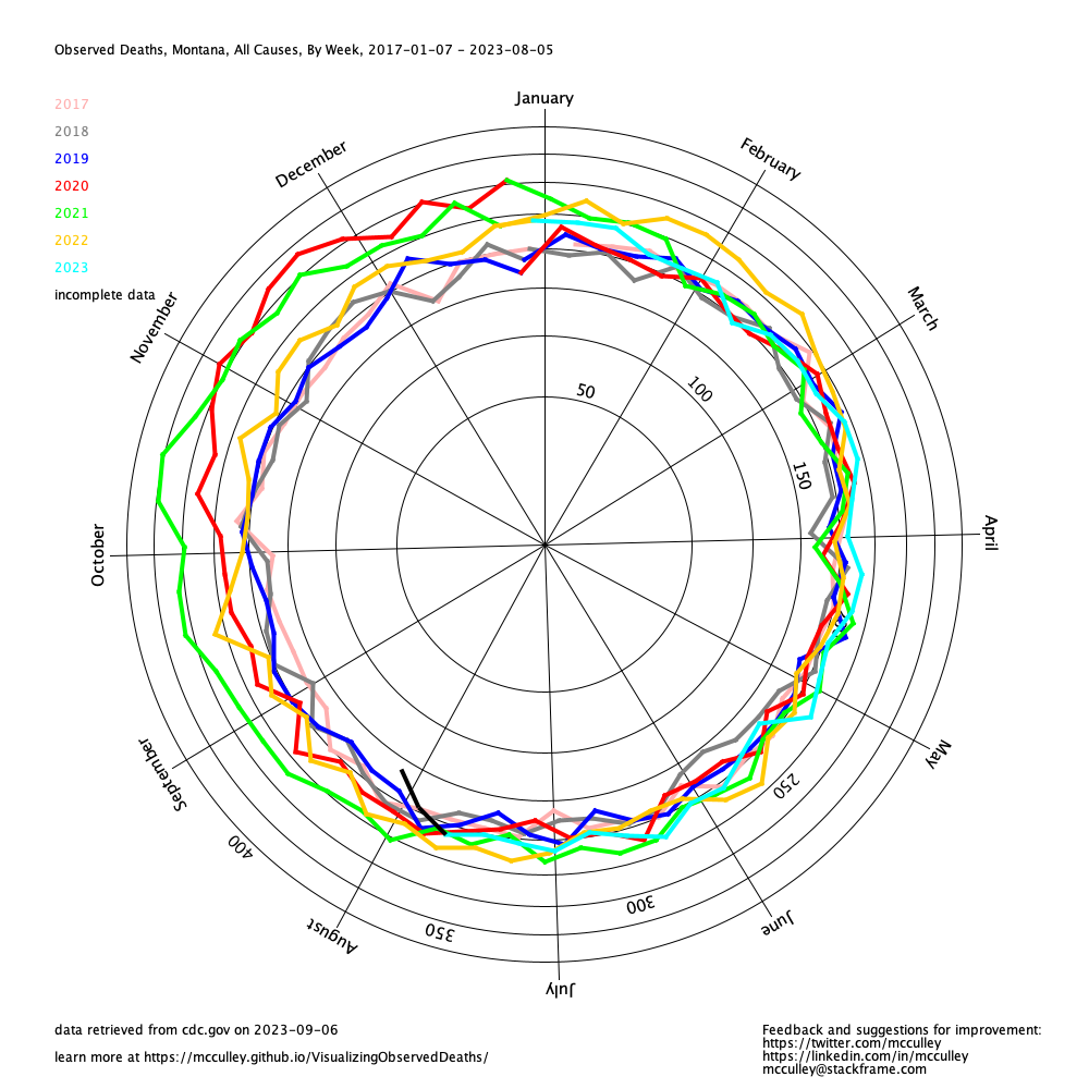
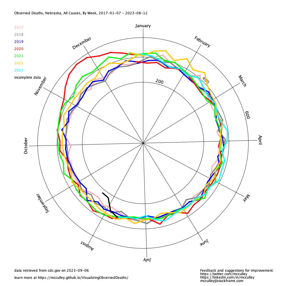
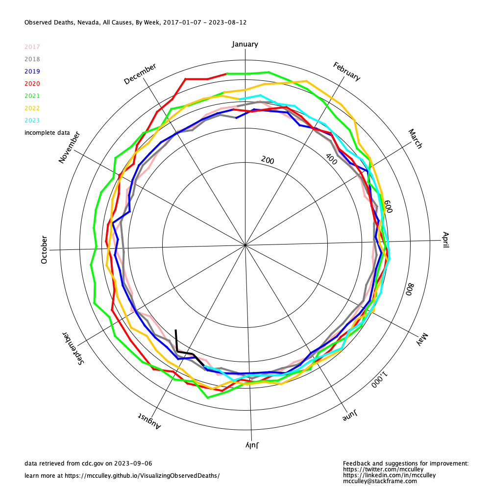
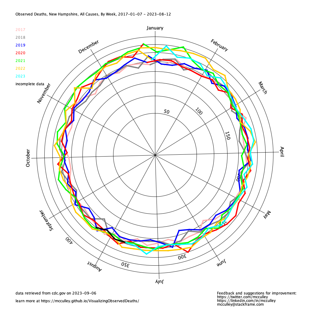
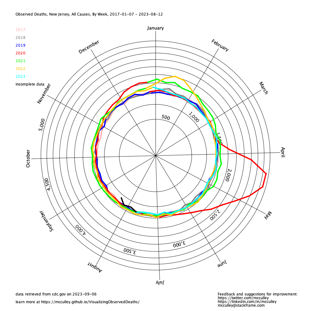
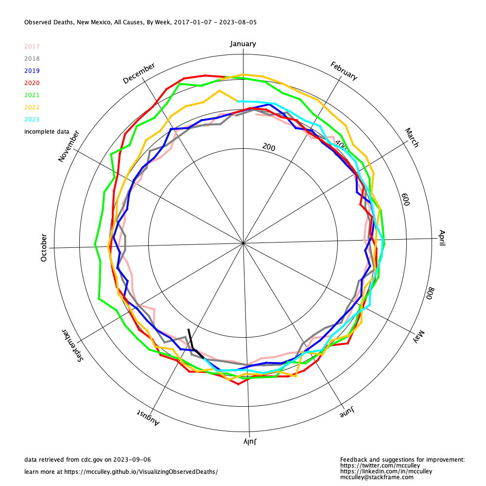
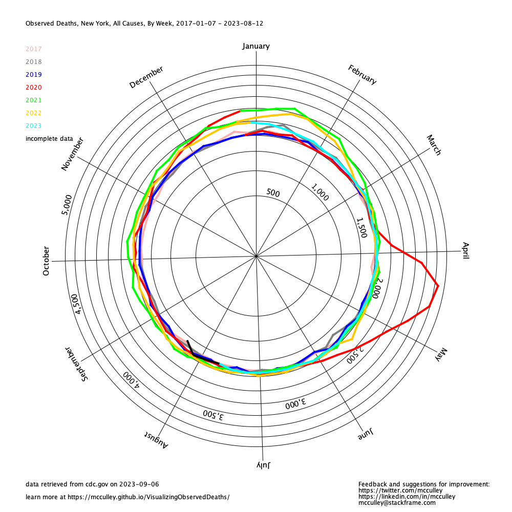
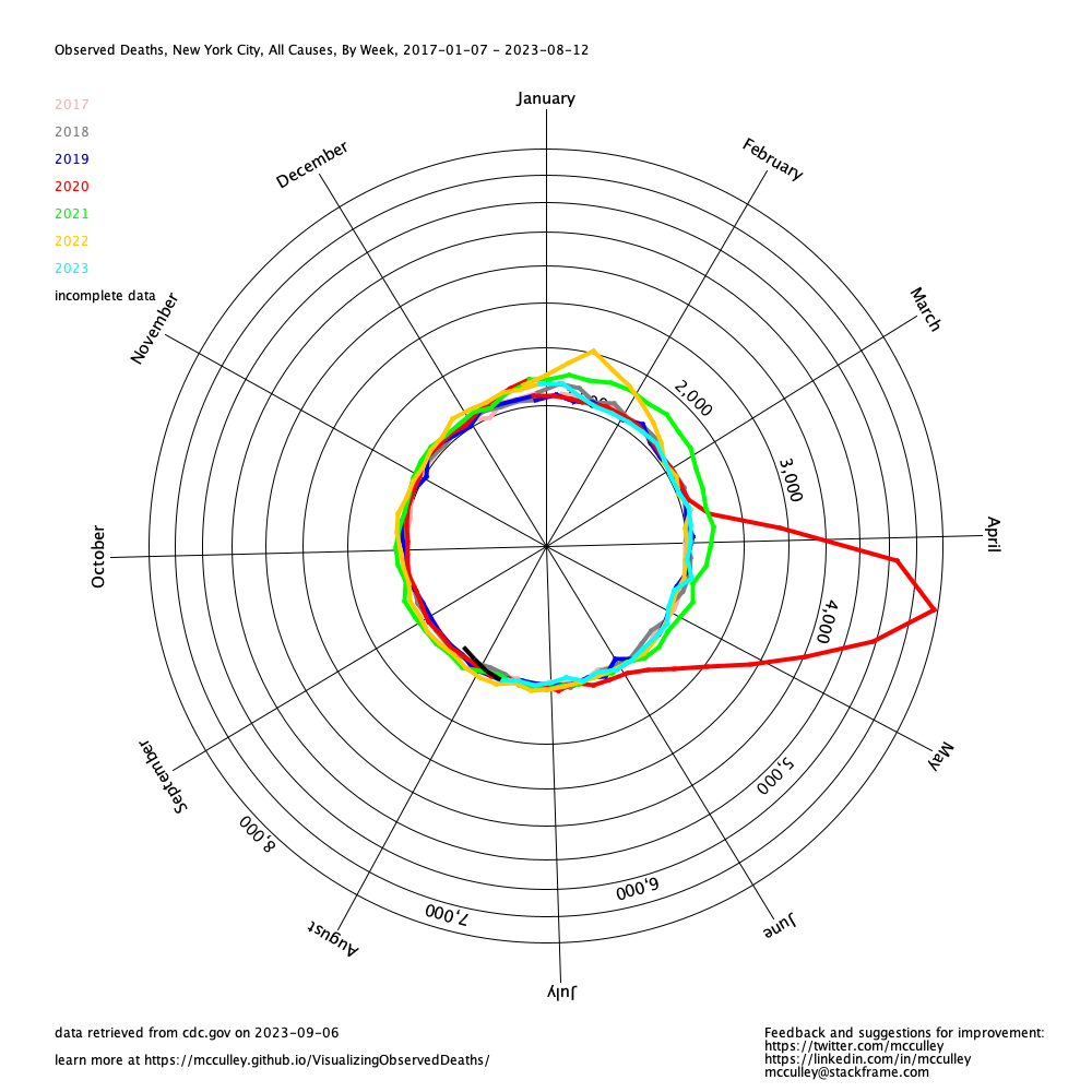
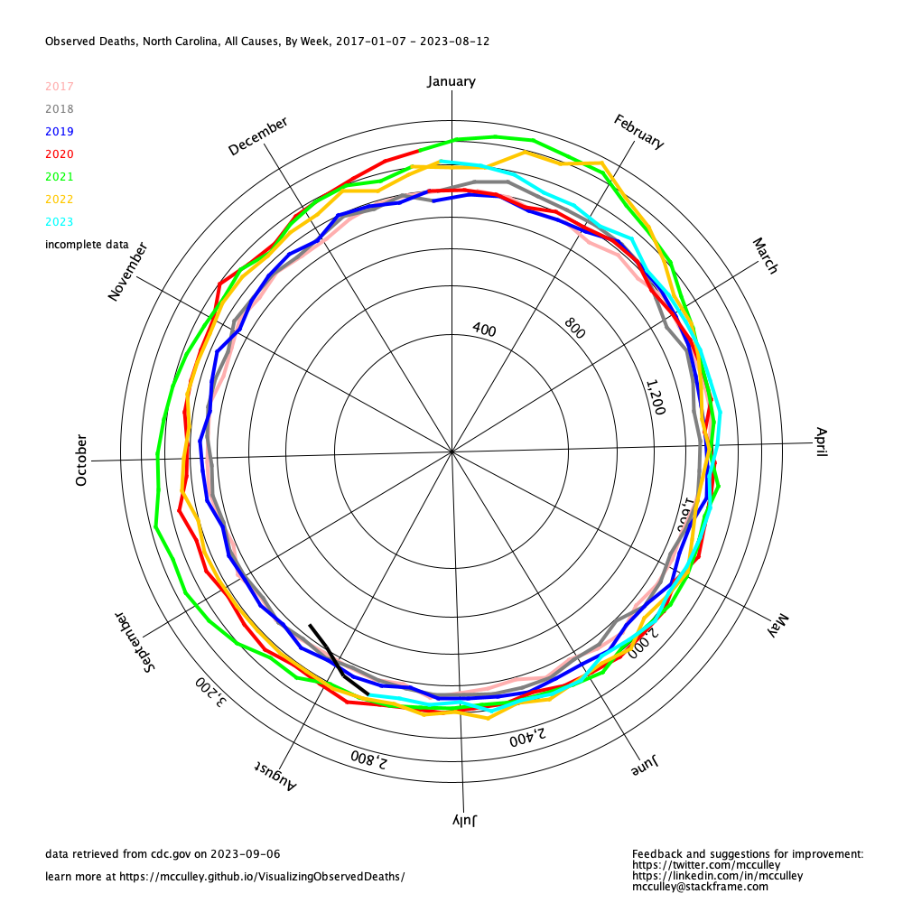
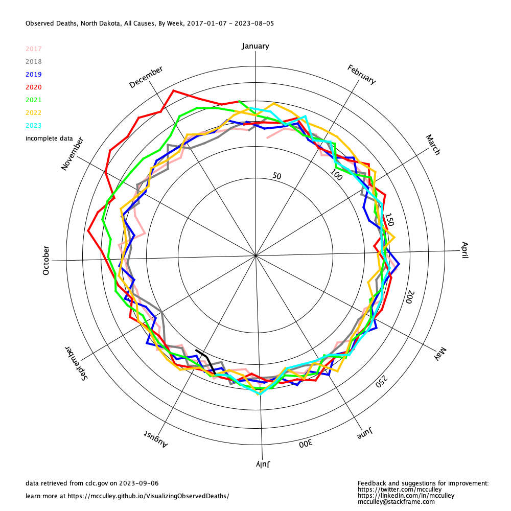
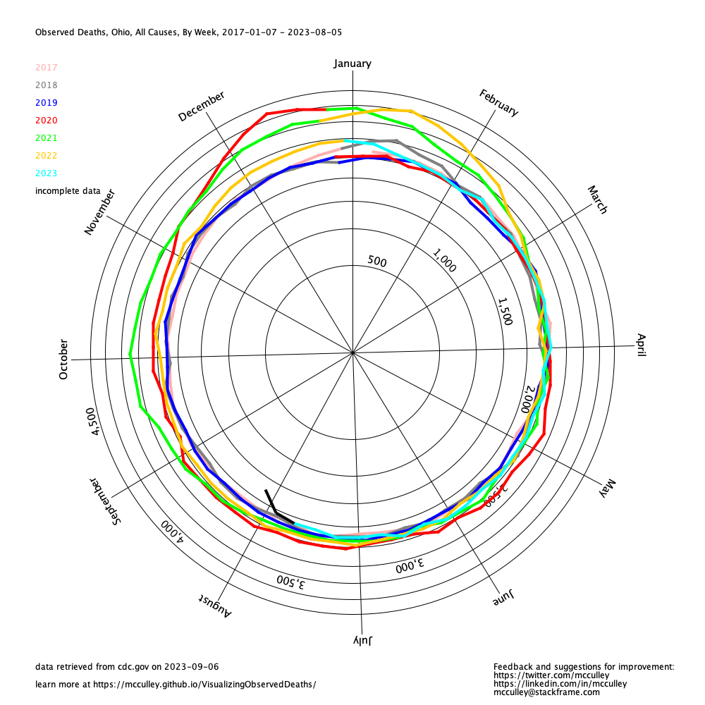
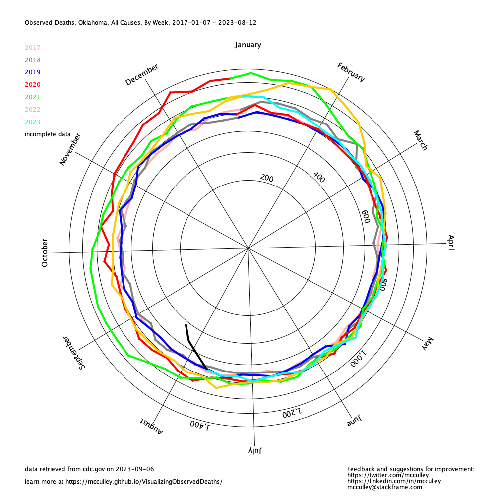
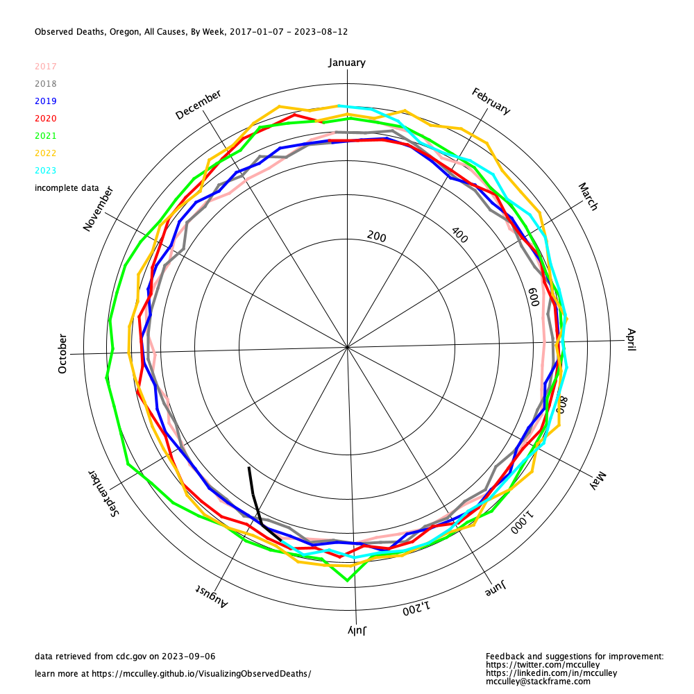
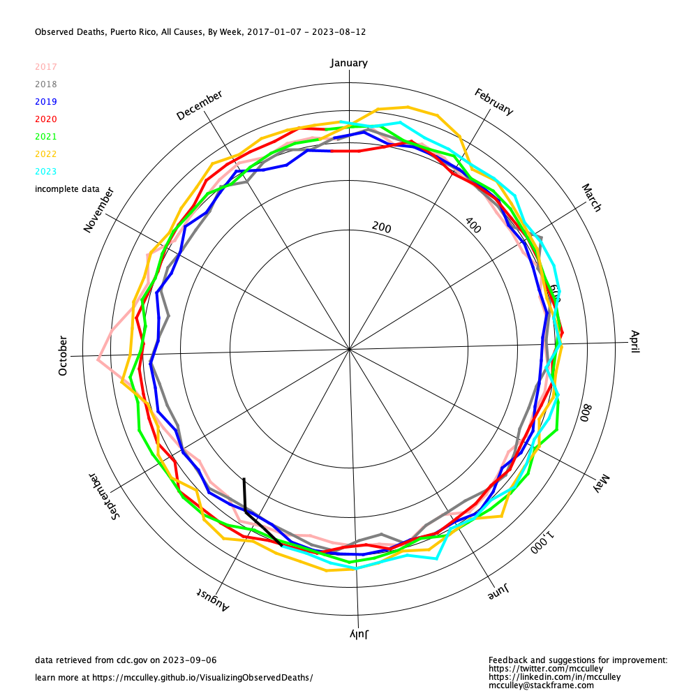
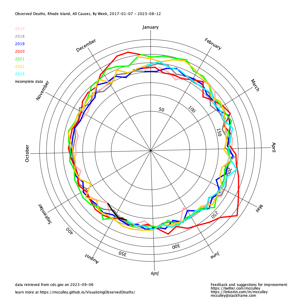
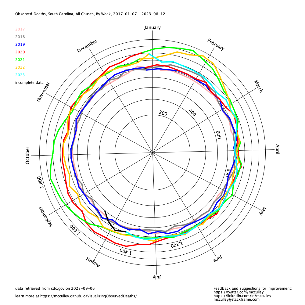
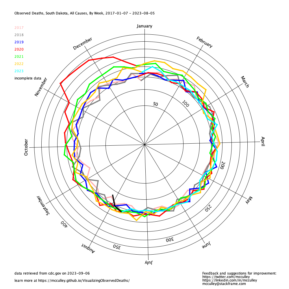
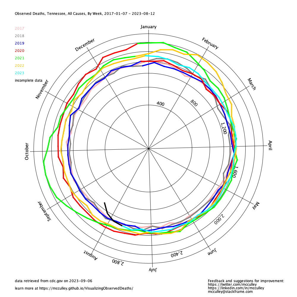
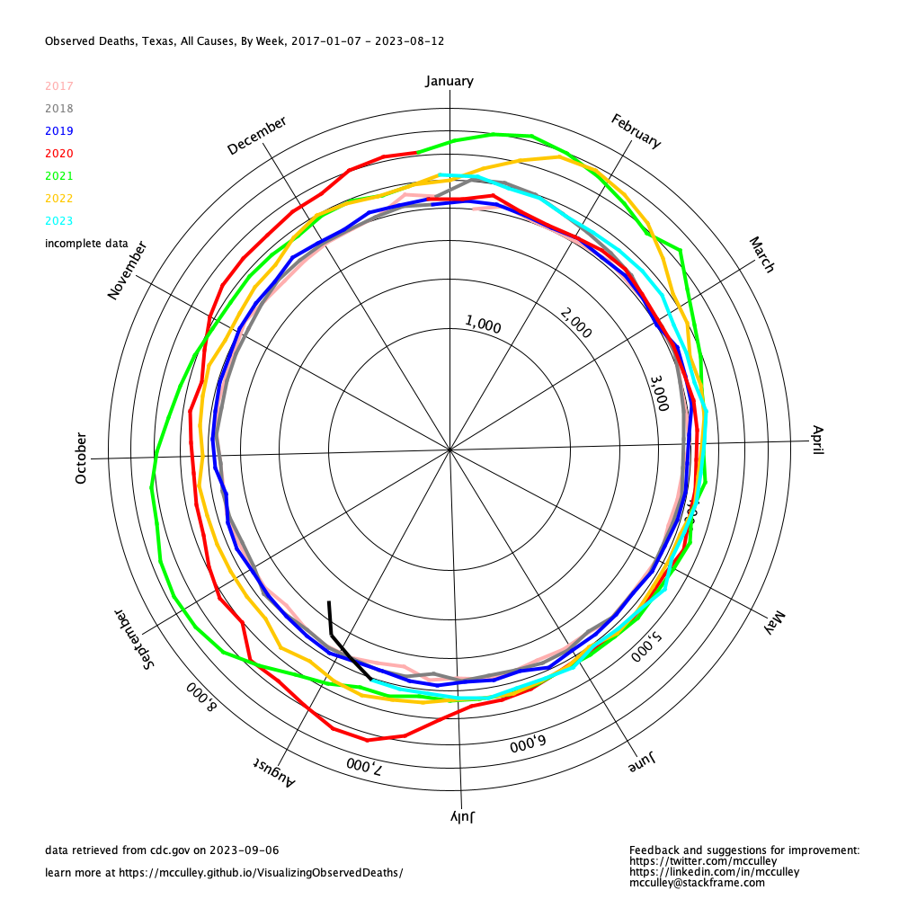
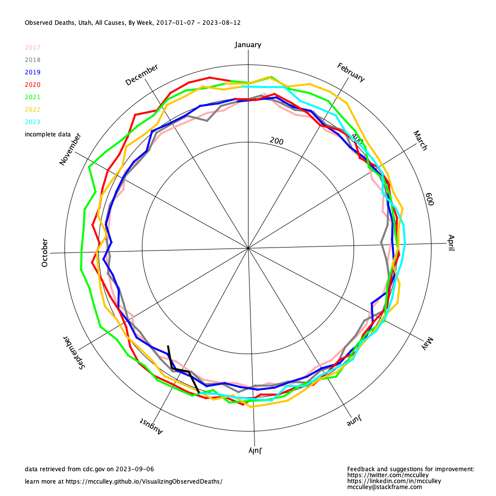
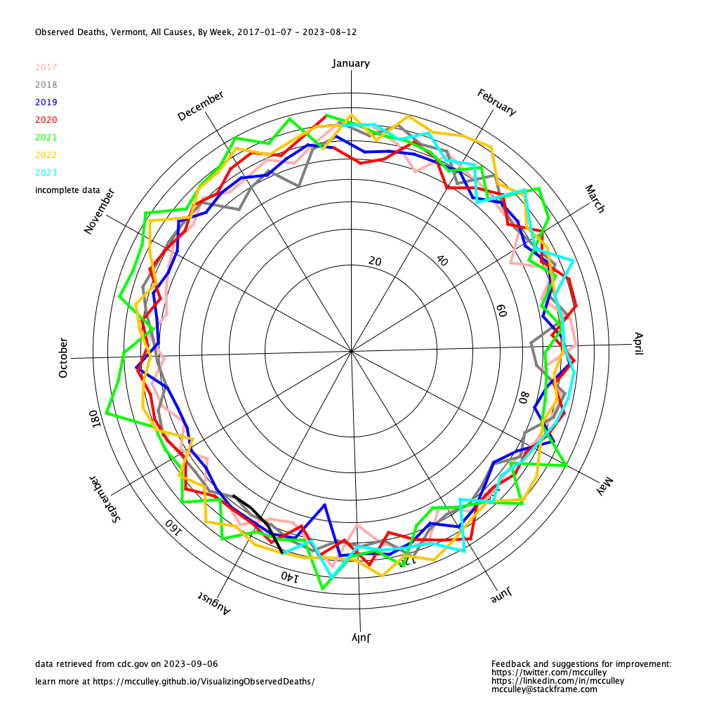
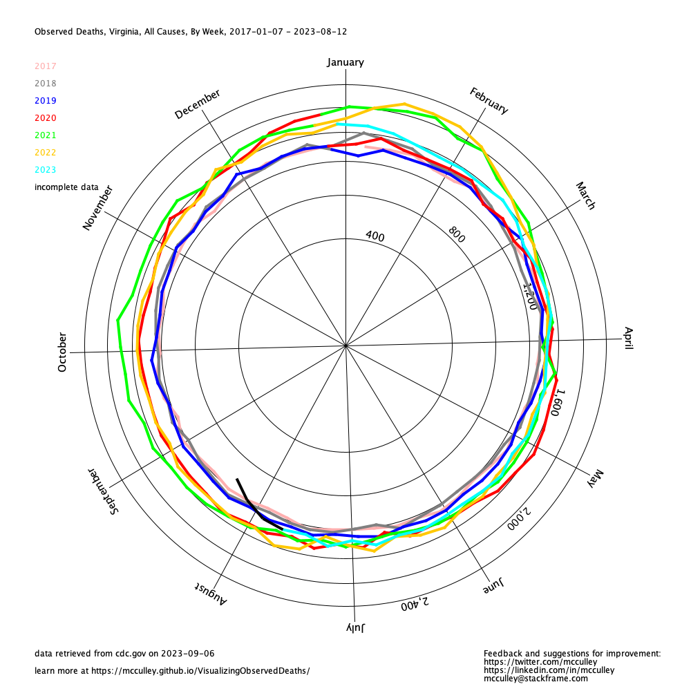
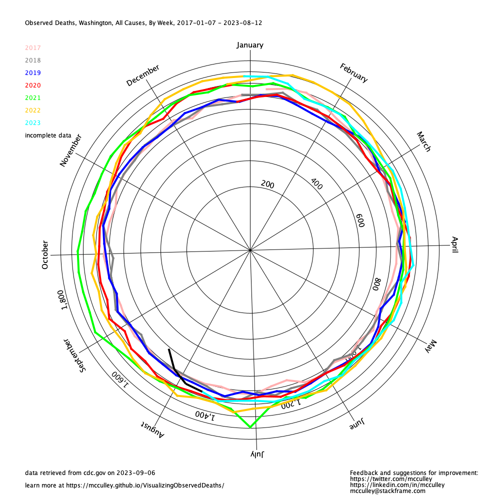
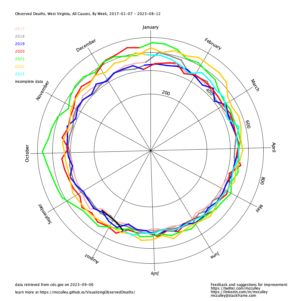
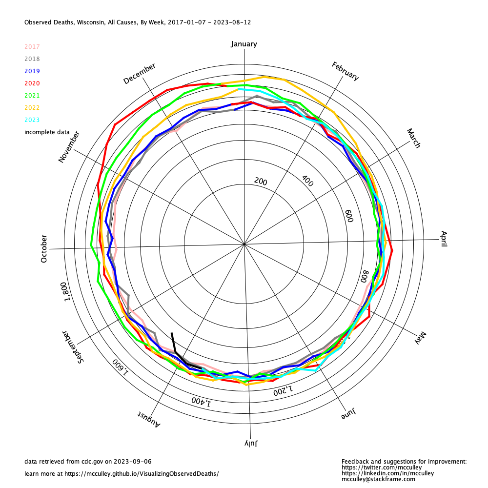
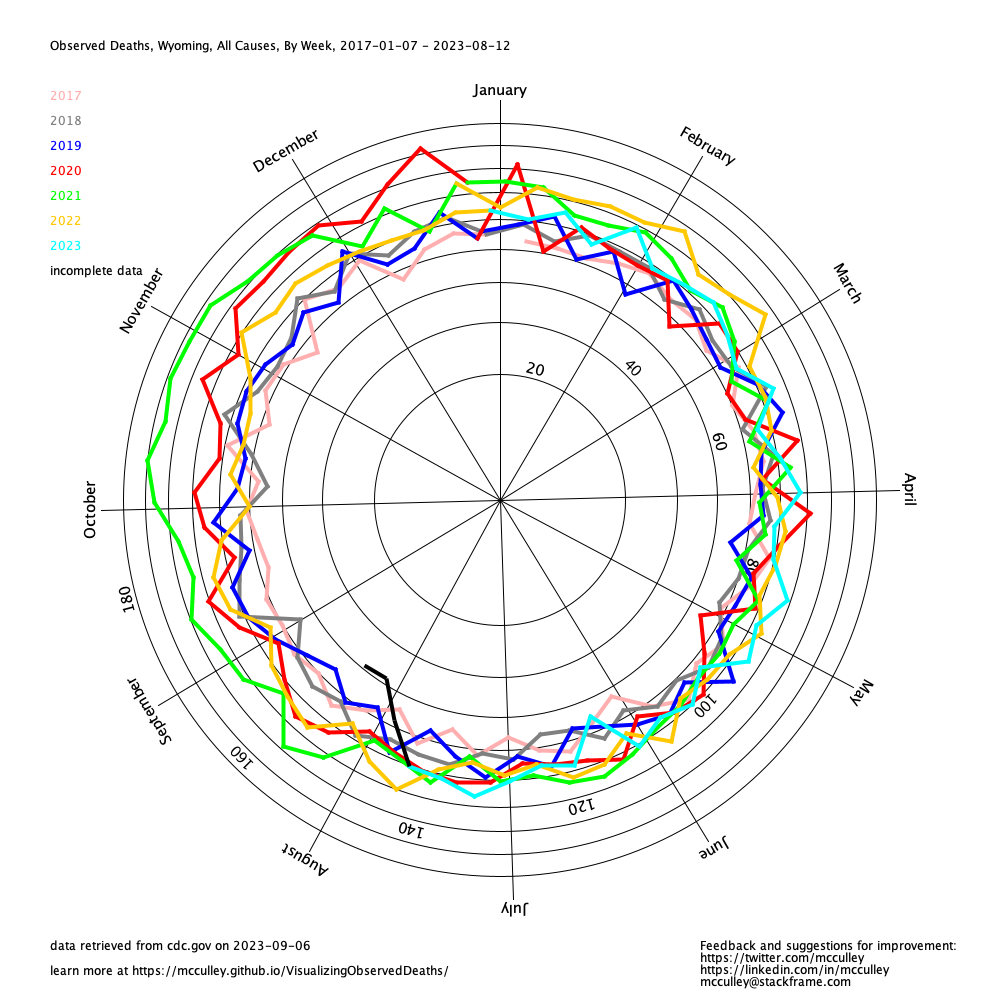
This is a visualization, using a polar area diagram, of the total observed deaths for every week using data published by CDC .
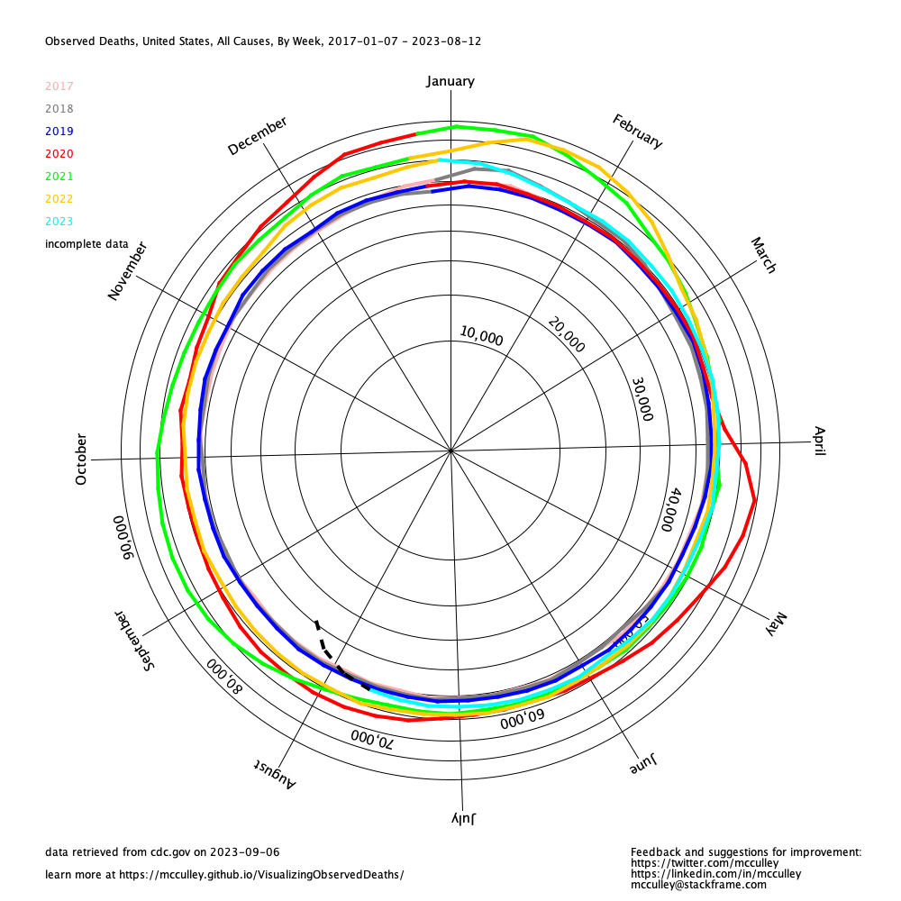
Using this kind of graph one can more easily see how changes year-to-year in total observed deaths have been affected by COVID-19. Using total observed deaths, one can disregard the (mis)attribution of deaths to COVID-19 and more clearly see the excess deaths due to failure of federal and state governments.
The radius of the graph is scaled by the square root of the count of deaths. This keeps the area equal for each ring. It may be not be immediately obvious why this is better, but keeping a linear radius led to a misleading effect in previous versions of this graph. Many thanks to commenters on Hacker News for setting me straight.
One thing that surprised me when building this was how much reporting lag there is. It apparently takes weeks for states to count death certificates and get them to CDC for distribution. Some states are worse than others. For example, for months in 2021, North Carolina's data was months out of date. Even where data is available for recent weeks, it cannot be trusted due to reporting lag. The data for a given week increases as more deaths are added. For this reason, the code uses a black, dashed line to mark the most recent six weeks of data. (A previous revision eliminated the most recent weeks where they are lower beyond the standard deviation of the weeks prior. This turned out to be less useful than expected because the under-reporting was well within one standard deviation for many regions.)
The code that drives these graphs runs weekly, so you can revisit this page to see the latest data. Source code is available at https://github.com/mcculley/ObservedDeathVisualizer. This was built by Gene McCulley. Send feedback and suggestions for improvement to mcculley@stackframe.com or @mcculley.
Follow the links below to see graphs for individual states and regions.